Title: What’s in a Font? The Deadpool Font Mystery Explained
If you’ve ever seen Deadpool, and I’m assuming most of you have, you’ll know that the movie is a wild ride of sharp wit, fourth-wall breaks, and a whole lot of violence. But what you might not have paid attention to is the font that graces the title card. Yes, I’m serious. The font. That big, bold, gritty “Deadpool” font. For some reason, it just fits the movie. It’s as if the font itself is telling you to expect chaos, sarcasm, and a whole lot of swearing.
But here’s the thing: Have you ever wondered what that font actually is? I mean, who decides on these things? Why this particular typeface? Well, my friends, let’s dive into the surprisingly deep world of the Deadpool font and uncover the quirky story behind it. Get ready for a little typography magic, mixed with a healthy dose of Deadpool’s signature irreverence.
The Deadpool Font: More Than Just Letters
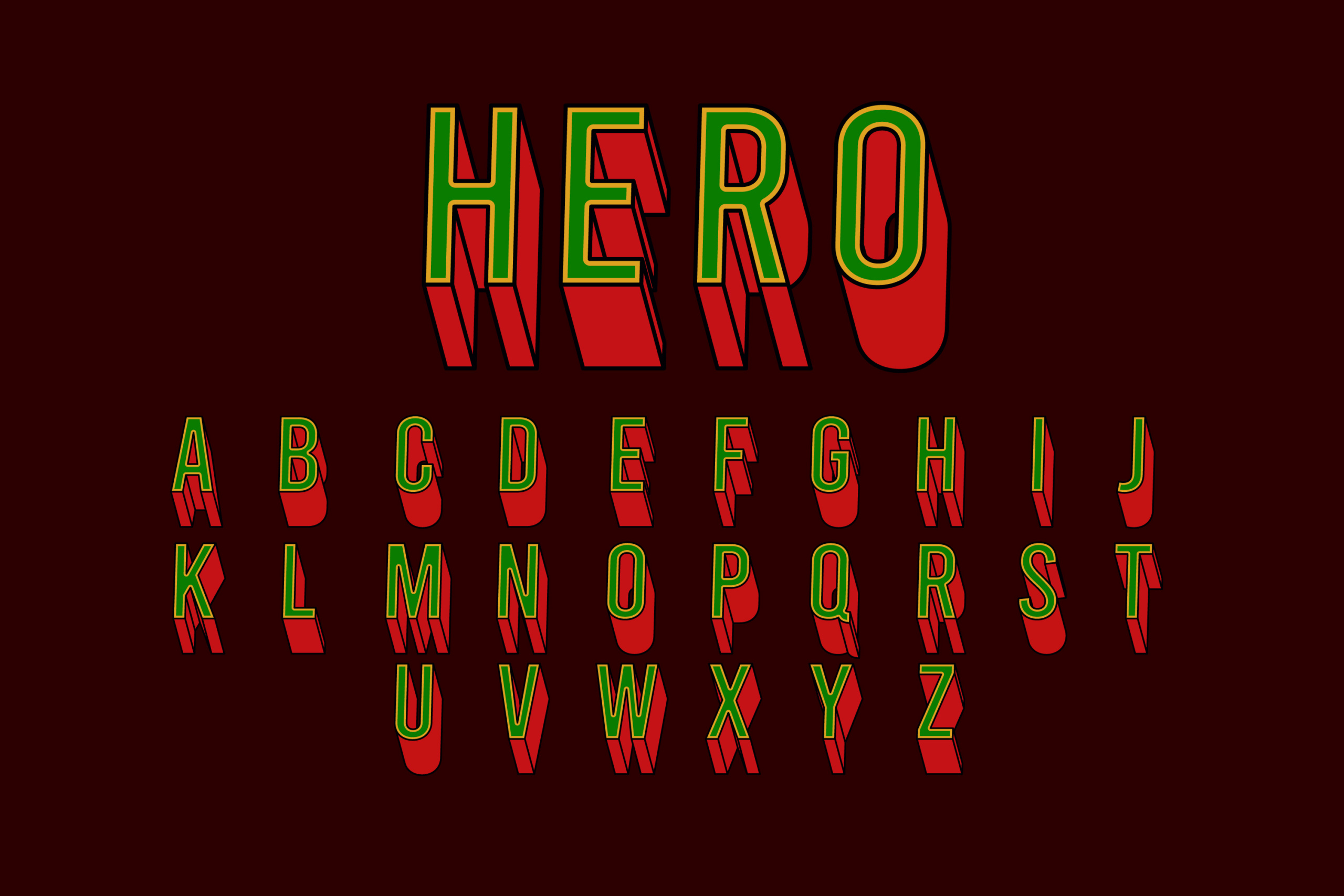
First, let’s address the obvious question: What is the Deadpool font? For those of you who are suddenly very invested in this, the font used for the title in the Deadpool movies is not a custom design. It’s actually based on a real font called “Deadpool Font” (surprise!). The font is available for free online through various font generators and has been lovingly called “Deadpool Movie Font” by fans across the internet.
When you look at it, you get this gritty, hand-drawn feel—almost like the movie’s protagonist scribbled it himself on a napkin with a sharpie, which is very much in line with Deadpool’s personality. It’s sharp, rough, and playful. There’s an edge to it, much like Deadpool’s humor. The sharp angles and the roughness of the font evoke a sense of danger, but also a kind of punk-rock attitude. This font is like Deadpool himself—flawed, rebellious, and unapologetic.
Font and Character: The Relationship Between Deadpool and Typography
Okay, we’ve established the basics. But let’s take a step back and talk about something deeper here: the relationship between a character like Deadpool and his font. Sure, you might think fonts are just a minor detail, but let’s think about it for a second.
Deadpool, as a character, is all about breaking conventions. He’s the guy who talks to the audience, who doesn’t follow the rules, and who takes a chainsaw to your expectations. So, it only makes sense that the Deadpool font mirrors his chaotic, unconventional energy. If you’ve seen Deadpool or Deadpool 2, you’ll notice that the font is not just on the title card. It shows up throughout the movie in various spots, like when Deadpool is talking to the camera, making fun of himself, or delivering a one-liner. The font is part of the character’s narrative, a visual cue that lets us know: This isn’t going to be your typical superhero movie.
It’s also worth mentioning that the font isn’t just used for Deadpool’s title cards—it’s seen in places that break the “fourth wall” of traditional filmmaking, much like Deadpool himself does. The font is frequently used for captions or sound effects, which makes sense because, let’s face it, Deadpool would never use something as traditional as Comic Sans to express his chaotic nature. No, he’s got something that feels as offbeat as he is.
What’s So Special About the Font?
Deadpool’s font isn’t just about looking cool—it’s about setting a tone. Think of it this way: What if Deadpool had a sleek, modern, clean font like Helvetica or something corporate like Times New Roman? That wouldn’t work at all, right? The tone would be totally off. The Deadpool font is gritty. It’s raw. It’s something that looks like it was written in haste or anger, which aligns with his character’s chaotic lifestyle.
If we look closely, the font has a jagged, almost hand-drawn quality to it. This gives us the impression that it’s something personal, like it’s coming from Deadpool’s chaotic mind. You can imagine him scribbling it in his sketchbook after an exhausting day of fighting bad guys, making jokes, and being generally reckless.
Here’s another fun fact: The font actually looks like it was inspired by the iconic lettering used in comic books. When you think of comics, you think bold and in-your-face typography. It’s the same idea. The font screams action, loudness, and excitement—just like the movie.
The Deadpool-Wolverine Connection: When Fonts Cross Over
For those of you who know Deadpool and his history with Wolverine, you probably noticed something interesting about the font in the first Deadpool movie. There are moments when it’s reminiscent of the typeface seen in X-Men Origins: Wolverine, where Deadpool was (not-so-gloriously) introduced. But in Deadpool, the font is much more refined—almost like a reclamation of the character. The movie isn’t just Deadpool’s first real solo outing; it’s a return to the essence of who he really is—a mutant who’s unapologetically irreverent and, as Ryan Reynolds would say, “one of a kind.”
Some font geeks might also notice that the Deadpool font shares a resemblance with a style often used for action movie posters or heavy-metal album covers. It’s aggressive, it’s sharp, and it speaks to the character’s wild energy. It’s as though this font is constantly saying, “Get out of the way, I’m coming for you.” Which, considering Deadpool’s approach to life, is absolutely fitting.
How to Get the Deadpool Font for Yourself
So now you’re sitting there thinking, “Alright, I need this font. But how do I get it?” Good news, my fellow Deadpool enthusiasts: the Deadpool font is available for free on the internet. A simple search for “Deadpool font generator” will lead you to various websites where you can download it or generate your own customized version of the Deadpool font. You can use it for posters, social media posts, or if you’re feeling extra, you could just make a big, bold sign that says “Deadpool” and hang it above your bed. No judgment here.
But before you rush to download it, let me remind you—while it’s fun to use the Deadpool font in all sorts of places, remember that it’s copyrighted. So, use it for personal projects, memes, or just for your own enjoyment, but keep it clear of anything that might require permission or licensing. You don’t want to end up in Deadpool’s crosshairs.
Deadpool Font and Pop Culture: A Legacy in the Making
The thing about Deadpool is that he’s not just a superhero—he’s a cultural phenomenon. And that font? It’s a piece of that phenomenon. Just like the character himself, the font has broken the rules. It’s not refined or professional, but it’s unforgettable. It’s made its mark not just on the screen, but in pop culture. And maybe that’s the most important thing about it.
Because at the end of the day, fonts are more than just letters strung together. They tell a story. They set a tone. And they evoke emotion. The Deadpool font? It’s bold, it’s brash, and it’s anything but subtle. It’s the perfect reflection of the antihero we all know and love. So, the next time you see that jagged lettering flash across the screen, you’ll know—it’s not just a font. It’s Deadpool’s spirit, encapsulated in every letter.
Now, if you’ll excuse me, I’m going to go redesign my personal website to include that font. Just for fun. Because, why not? Deadpool would approve.