Title: Why Gold Texture Is More Than Just a Trend: The Secret to Making Your Designs Shine
Gold. It’s more than a color. It’s a feeling, a mood, an aura of luxury that has permeated cultures for centuries. Whether it’s the glint of a golden ring on your finger, the warm glow of a golden sunset, or the dazzling beauty of gold leaf decorating an art piece, gold has a way of making everything feel just a little bit more… special.
But here’s the thing: I don’t want to talk about gold in the traditional sense. No, I’m not here to tell you about its role in ancient civilizations or its place in the jewelry market. What I really want to dive into is something you’ve likely seen everywhere but never really thought about in the way you should: gold texture.
You see it all the time in graphic design, digital art, websites, even Instagram posts—gold foil texture, gold leaf texture, and even that luxurious rose gold texture that has taken over our phones, laptops, and coffee mugs. But what is it about this golden shimmer that makes it so irresistible? Why are we obsessed with adding a little gold to everything? And more importantly, how can you use it to make your own designs not just good, but golden?
The Allure of Gold Texture: More Than Just Sparkle
If you’ve ever browsed through design websites or templates, you’ve probably noticed a common thread in a lot of the high-end designs: gold. Not just regular gold, but gold texture—whether it’s the smooth shimmer of gold foil, the crinkly organic patterns of gold leaf, or the understated elegance of a soft rose gold gradient. And if you’re like me, you’ve probably wondered why this texture is so universally adored.
Let’s start with the obvious answer: gold texture makes things look expensive. It’s as simple as that. The minute you add gold to anything, whether it’s a font, background, or image, it immediately elevates the design. It’s like the equivalent of putting on a velvet dress—it’s just fancy, and it doesn’t even need to try.
But beyond the surface-level shine, there’s something deeper about gold’s allure. Gold, as a texture, carries connotations of prestige, class, and even mysticism. For centuries, it’s been used to symbolize the divine, the eternal, the best of the best. When you add gold texture to a design, you’re not just adding color—you’re invoking these ancient feelings and associations. It’s not a coincidence that luxury brands like Chanel, Louis Vuitton, and Gucci use gold accents to communicate their premium status.
But gold texture isn’t reserved for high-end brands and fancy invitations. No, in 2023, even a humble blog post or social media graphic can take on a golden glow, making everything look just a little bit more polished and professional.
Types of Gold Texture: From Foil to Leaf to Rose Gold
So, you’re probably thinking: “Gold is gold, right? How different can the textures really be?” Well, let me tell you, there’s a world of difference between the various types of gold textures, and each one evokes its own unique vibe. Here’s a breakdown of some of the most popular:
1. Gold Foil Texture
This one is the classic. Think shiny, reflective, and smooth with just a little bit of irregularity. Gold foil texture is often used in graphic design to add that high-end, boutique feel. When applied correctly, it mimics the look of actual gold leaf but in a more streamlined, polished way. It’s perfect for wedding invitations, logos, and anything that needs that extra touch of elegance.
Why we love it: Gold foil texture gives us that luxury without the fuss. It’s sophisticated but also approachable—easy to use, yet still visually stunning.
2. Gold Leaf Texture
This texture takes things up a notch by adding a bit of organic charm. Gold leaf is more irregular, with slightly crinkled or textured edges that make it feel less “perfect” than gold foil. It’s not about uniformity; it’s about the uniqueness of each piece. This texture often evokes a feeling of antiquity and craftsmanship, and it’s perfect for projects that need an artisanal or vintage flair.
Why we love it: Gold leaf texture makes us feel like we’re wearing the crown of a queen who’s just a little bit wild—a blend of luxury and natural beauty.
3. Rose Gold Texture
Let’s face it—rose gold has had its moment. And while some trends come and go, rose gold seems to be one that’s sticking around for the long haul. It’s the softer, more romantic cousin of traditional gold, with a slight pinkish tint that feels playful yet elegant. Rose gold texture is perfect for brands or designs that want to communicate a modern, fresh, and stylish vibe without going overboard on flashiness.
Why we love it: Rose gold brings a feeling of warmth and coziness to any design. It’s like the chic sister of gold that’s just a little bit more approachable.
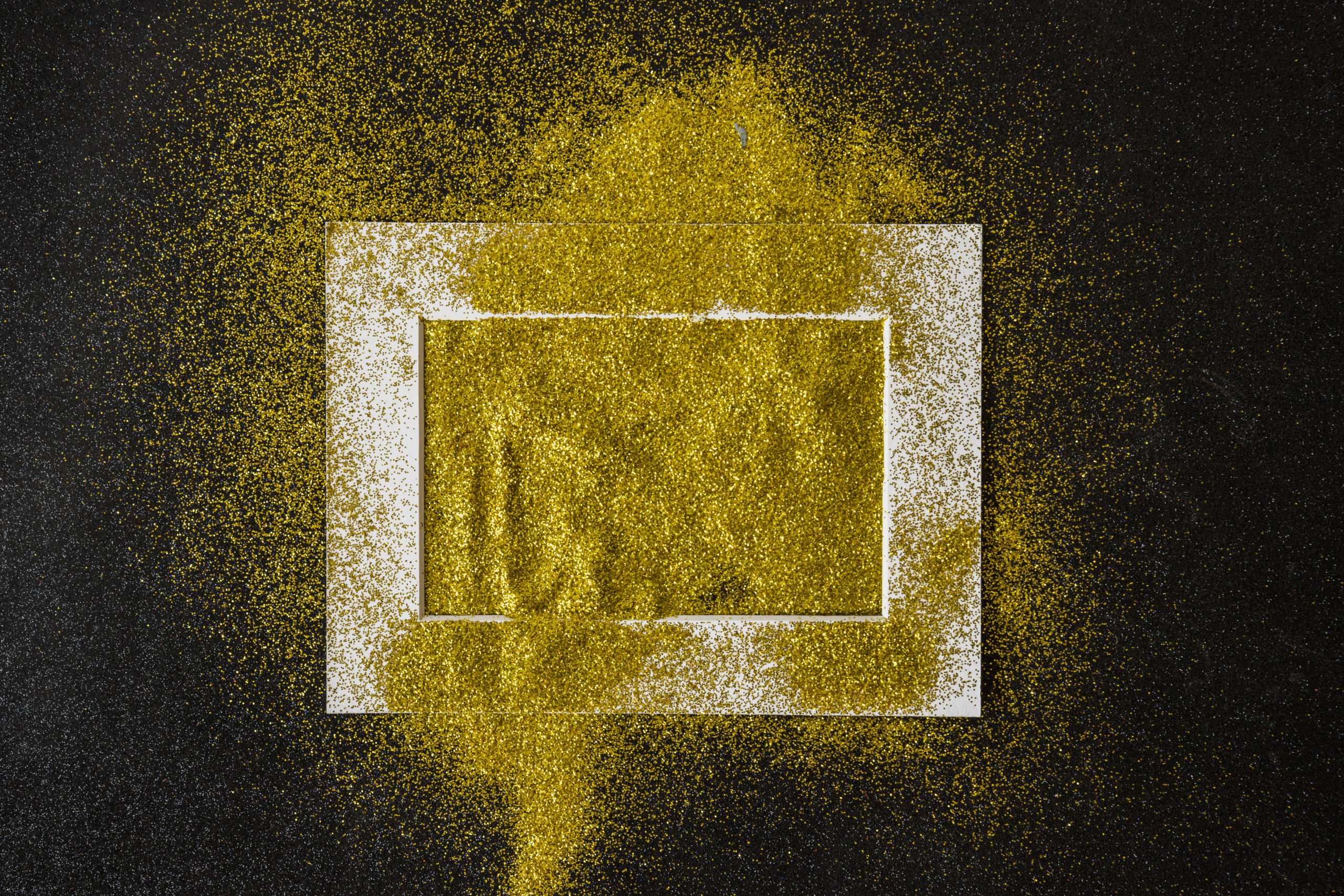
4. Gold Texture Backgrounds
Now, this is where it gets interesting. A gold texture background can completely transform the energy of a design. Whether it’s a subtle golden gradient or a bold gold-leaf splattered across the screen, using gold as a background instantly shifts the tone of your project. It becomes not just an accent but a centerpiece, setting the mood for whatever is placed on top of it.
Why we love it: Gold texture backgrounds bring a sense of depth and richness to a design. They make whatever you’re showcasing look more important, more noticeable, and—dare I say—more worthy of attention.
Gold Texture in Graphic Design: How to Make Your Work Shine
Alright, so we’ve established that gold texture is amazing. But now the real question is: how do you use it to make your designs pop? Whether you’re working in Illustrator, Photoshop, or even Canva, there are some key tips and tricks that will help you elevate your design game with a little golden magic.
1. Don’t Overdo It
As tempting as it is to coat everything in gold, remember that less is more. A little gold goes a long way. Use it as an accent rather than the focal point. Try layering it over a textured background or using it to highlight key parts of your design. Whether it’s a gold foil border around your logo or gold leaf specks on your text, the key is subtlety.
2. Layer with Other Textures
Gold works beautifully with other textures. Try combining it with matte black, deep navy, or even pastel shades to create a balanced look. Mixing textures—like pairing a smooth gold foil with a rough canvas background—can add dimension and make your design feel more dynamic.
3. Be Mindful of the Color Palette
Gold texture doesn’t exist in a vacuum—it interacts with the other colors around it. If you’re using a gold texture background, make sure your text and other design elements contrast enough to be readable. For instance, white or black text looks stunning against a rich gold foil texture. But keep in mind the overall vibe you’re going for—gold can come across as luxurious or playful depending on the context.
4. Play with Lighting and Shadow
Want to take your gold texture to the next level? Try experimenting with light and shadow effects to make the gold appear more three-dimensional. A well-placed shadow can make your gold elements look more realistic, almost as if you could reach out and touch them. It’s these little details that make the difference between a good design and a great one.
The Timelessness of Gold: Why It’s Here to Stay
Gold is timeless. Sure, other design trends come and go, but gold textures have been around for centuries—and they’ll continue to shine for years to come. Whether you’re designing a logo, crafting a website, or putting together social media graphics, incorporating gold into your work is like adding a secret weapon to your creative arsenal.
And here’s the beauty of it: gold doesn’t just make your work look good—it makes your audience feel something. It evokes feelings of luxury, quality, and prestige, and when you use it correctly, you’re not just creating a design—you’re creating an experience.
So, the next time you’re sitting down to work on your design, think about the magic of gold texture. It’s not just a trend. It’s the secret to making your work shine. And trust me—when you add a little gold into the mix, your designs will never be the same again.