The Y2K Logo Trend: Why It’s Back and How You Can Create One
The year 2000—remember that? The anxiety, the hype, the countdown to Y2K—a world where technology was supposed to collapse, and we were all going to be stuck with no electricity, no internet, and maybe even no Netflix (gasp!).
But, spoiler alert: the world didn’t end. Instead, we got a shiny new millennium, a whole new set of fashion trends, and most importantly, the Y2K aesthetic. From low-rise jeans to chunky highlights, this style had it all. Now, nearly two decades later, the Y2K aesthetic is back, and not just in fashion—it’s in logos too.
I know, I know—logos? Let me explain. The Y2K logo is more than just a design; it’s a movement, a statement, and maybe even a little bit of nostalgia mixed with the power of the internet. But if you’re wondering, “What exactly is a Y2K logo, and how can I make one?”—buckle up, friend. This blog is about to take you on a journey through the neon-lit, futuristic (but retro) world of Y2K logo design. Spoiler: You might just want to create your own by the end of it.
What Is a Y2K Logo?
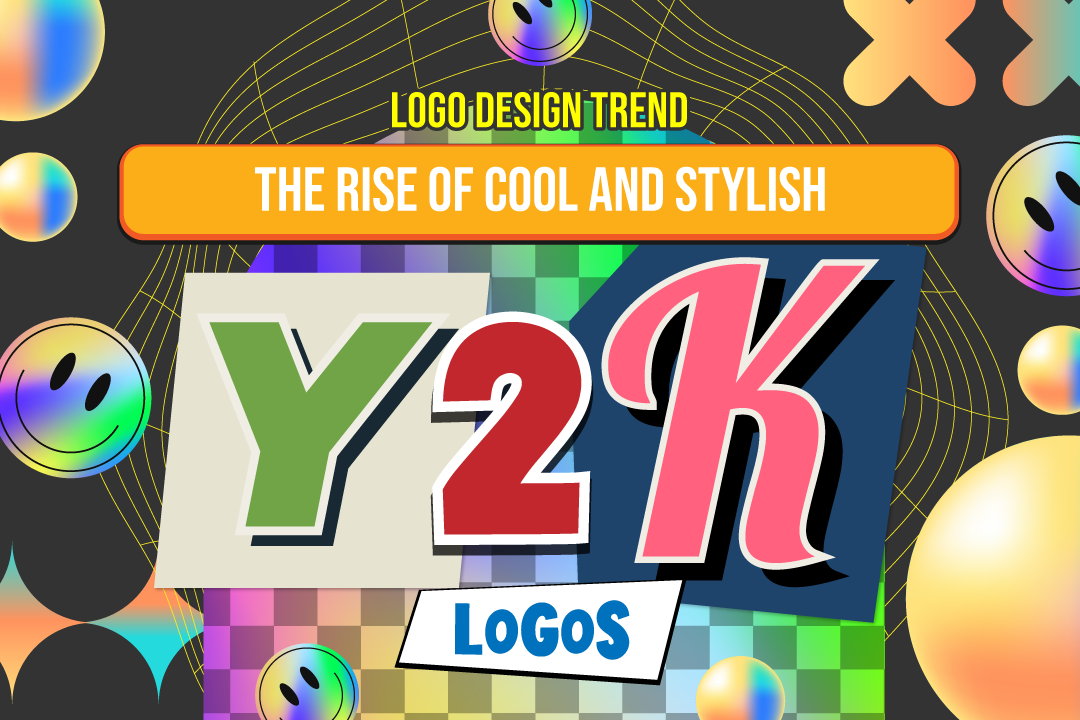
A Y2K logo is a design that evokes the aesthetics and technology-driven optimism of the turn of the millennium. Think about it: it was a time when tech was moving fast, and everyone was convinced that the future was going to be shiny, metallic, and digital—kind of like how people imagine a 90s-era version of a “futuristic” world. It’s a bit like a techy, cyberpunk fever dream mixed with chunky fonts, neon glows, and web-inspired imagery.
We’re talking about logos with metallic textures, gradients that look like they were plucked straight out of a Windows XP screen saver, and fonts that scream “we’ve entered the future, but we’re still holding onto dial-up internet speeds.” It’s bold, it’s flashy, and it’s unapologetically nostalgic.
Why Is Y2K Aesthetic So Popular Again?
The Y2K aesthetic is having a major comeback, and if you’ve been on the internet lately, you’ve probably seen this old-meets-new design making its way into fashion, branding, and even pop culture. But why? It’s simple. In a world that feels increasingly uncertain and technologically advanced, people crave a bit of nostalgia for simpler, albeit more chaotic, times.
The early 2000s were a golden age of digital optimism, even if we were a little too obsessed with the idea that the world was going to implode on January 1, 2000. We wanted to look forward to a future that was bright, shiny, and full of possibility—one where everything was going to be digital, and nothing would ever go wrong (LOL, look at us now).
Now, as we face another round of global uncertainty, it seems like the perfect time to look back to a time when we thought the future was nothing but endless potential. And what better way to celebrate that feeling than with a logo that screams “we made it through the Y2K bug, and we’re still here”?
How to Make Your Own Y2K Logo
So, you’re ready to jump on the Y2K train. You’re thinking, “This aesthetic is fire, but how do I actually create a logo that embodies it?” Well, friend, I’ve got you covered. It’s easier than you might think to channel your inner Y2K design guru and make a logo that feels both retro and forward-thinking at the same time. Here’s how to get started:
1. Choose the Right Font
When you think of a Y2K logo, think bold, chunky, and maybe even a little quirky. You want something that feels futuristic, but not too sleek. The fonts that define this aesthetic are usually a little bubbly, with exaggerated curves, sharp angles, or a digital glitch effect. It should make you think of early 2000s pop culture: think of the MySpace era, when everyone’s profile was just so—sparkly backgrounds and all.
Some great fonts to get you started include:
- Techno fonts (these feel very computer-esque)
- Bubble fonts (because Y2K was all about playfulness)
- Pixelated or glitchy fonts (perfect for that early web vibe)
2. Use Metallic and Gradient Effects
Y2K logos love gradients. They scream “I’m shiny, and I’m not afraid to show it.” But it’s not just any gradient—it needs to look a little out of this world. Think about blending silver, electric blue, or neon pink to give your design that otherworldly glow. Gradients that feel digital, shiny, and reflective will transport you straight back to a time when tech felt more magical than it does today.
3. Add Neon or Glowing Effects
Neon lights were a huge part of the early 2000s digital aesthetic. Whether it was a club sign, a website header, or an MTV promo, neon was everywhere. For your Y2K logo, you can’t go wrong with adding some neon effects to the text or imagery. Make it glow. Make it pop. This gives it that electric, tech-inspired vibe.
4. Experiment with Digital Elements
The early 2000s was when the internet was starting to feel like a real “thing.” So, to really nail the Y2K vibe, incorporate digital or technological elements. Think pixels, glitch effects, or even retro web icons. The more you can make it feel like it’s a logo born from the early days of the internet, the better.
You could even consider adding something like a web cursor arrow, computer chip, or even something as basic as a “loading bar” (because we’ve all been there—waiting for that webpage to load, right?). These subtle details will scream Y2K while giving your design a little bit of personality.
5. Add Some Iconography
If you’re feeling extra creative, try pairing your logo with a simple graphic that complements the theme. This could be a simple 3D object or something more complex like a futuristic cityscape. Think of those old-school, tech-inspired logos from companies like Nokia or early computer brands. Minimalist, yet still bold enough to stand out.
6. Use a Logo Maker or Template
Let’s be honest, not all of us are graphic designers, and that’s totally okay. Luckily, there are plenty of online Y2K logo generators and logo templates that you can play around with to create your vision. Platforms like Canva, Looka, or even a Y2K logo maker specifically designed for this aesthetic can help you create something polished without needing a design degree.
Why Should You Create a Y2K Logo?
Maybe you’re thinking, “But why would I need a Y2K logo? I’m not starting a tech company.” Well, let me stop you right there. You don’t need to be launching the next big software company to embrace the power of a Y2K-inspired logo. Here’s why:
- Nostalgia: The Y2K aesthetic taps into that beautiful feeling of nostalgia for simpler, more carefree times. It reminds us of the late 90s and early 2000s when we were living in a world that felt like a futuristic dream (even if it was mostly dial-up internet and flip phones).
- Trendiness: Retro trends are in, and the Y2K aesthetic is no exception. Whether you’re creating a personal brand, a small business, or just want to have fun, a Y2K logo could easily help you tap into this cool, nostalgic vibe.
- Creativity: Designing a Y2K logo lets you get creative with colors, textures, and visual elements. It’s an aesthetic that allows you to have fun with fonts, shapes, and futuristic vibes—giving you freedom to create something truly unique.
Final Thoughts: Embrace the Y2K Comeback
So, there you have it. The Y2K logo trend isn’t just for web designers and corporate rebrands—it’s for anyone who wants to add a little sparkle and nostalgia to their brand. Whether you’re designing something for a new blog, a small business, or just for fun, embracing this aesthetic is like celebrating both the future and the past at the same time.
Don’t be afraid to dive in and experiment. After all, the Y2K aesthetic is all about boldness and brilliance. So, go ahead—create that logo that’s flashy, a little funky, and full of potential. The future is now—and it’s looking pretty neon.


