The Dark Charm of Coraline: Why That Font Feels Like a Mystery Wrapped in Shadows
There’s something irresistibly magnetic about Coraline. It’s not just the strange, alternate world that pulls us in. It’s not merely the eerie, unsettling atmosphere that lingers long after the credits roll. No, what really sinks its claws into us is something much simpler, yet far more potent—the font. Yes, you read that right. The font.
Let’s take a moment to examine something most people wouldn’t even notice at first glance: the title font of Coraline. It’s not just a font; it’s a statement. It speaks the language of twisted fairy tales, of oddities lurking behind every corner, of something that feels a little too… wrong. And like the story itself, the font exudes a sinister charm that makes you want to keep looking, even though you feel like maybe, just maybe, you shouldn’t.
Now, I know what you’re thinking. “It’s just a font, right?” But, hear me out. Fonts are the unsung heroes of storytelling. They set the mood, create expectations, and add layers to an experience. In the case of Coraline, that font is almost like an invitation—a dark, cryptic one—to dive deeper into the strange world that awaits.
The Font that Speaks to You
So, what exactly is this Coraline font, and why does it feel so hauntingly perfect for the world it represents? The font used in the movie’s title is a custom creation that’s vaguely reminiscent of early 20th-century typewriter fonts, mixed with a touch of the whimsical and the eerie. It’s almost as if the font itself is an eerie invitation, promising that behind the clean, straightforward lines, there’s something lurking in the shadows.
If you look closely at the Coraline font, you’ll notice something interesting: the letterforms are not quite smooth. They have sharp edges, little flicks, and delicate imperfections. This detail makes the font feel handmade, almost like it’s scribbled by the mysterious, Other Mother herself. It’s as if the letters are somehow… alive. It’s not the pristine, polished kind of font you’d expect from a cheerful children’s movie. It’s the kind of font that hints at a hidden world just beneath the surface, a world where things are not as they seem.
The Coraline font sets the tone for what’s about to come. It’s a visual representation of the weird, unsettling, and ultimately magical journey you’re about to go on. It’s almost like the font is a co-conspirator in the story, helping to pull you into that world just a little bit more.
Fonts: The Silent Storytellers
In a world where visuals and sounds often take the spotlight, fonts tend to be a quiet partner in the storytelling process. But like the faint rustling of wind in the trees or the subtle shift of shadows in a dark room, fonts have a way of influencing how we feel, even without us realizing it. Think about it: we don’t often consciously analyze fonts, but when they’re done right, they can become an integral part of the narrative experience.
Take Coraline, for example. The title font doesn’t just introduce us to a movie; it gives us a glimpse of the world we’re about to enter. It’s the digital equivalent of a door creaking open, revealing the strange and mysterious things that await inside. It feels like it’s daring you to enter, but also warning you that the other side might not be what you expect. And that’s what makes it so brilliant.
The Mystery Behind the Font
The exact name of the Coraline font is a bit tricky to pin down. You won’t find it in your standard font libraries or design tools like you would with Helvetica or Times New Roman. The font used in the title is actually a custom creation, making it one of those fonts that only exist in the realms of Coraline fans, designers, and a few select enthusiasts. But even without the exact name, you can find fonts that mimic its unique vibe. Fonts like “Creepster” and “Feather,” or other spooky, quirky styles, come close to capturing that Coraline essence. They bring the right amount of weirdness and charm to your own creative projects.
For those of us who want to channel a little bit of that Coraline magic, font generators have become a godsend. You can now download similar fonts from various online sources, many of which are free for personal use. There’s something so satisfying about typing out “Coraline” in a font that feels almost like it could belong to that strange, alternate universe. It’s like opening a window into the world where things aren’t quite as they seem—where everything feels a little off, but still just familiar enough to make you want to look closer.
The Power of Fonts in Our Digital World
In today’s world, fonts are more than just decoration. They’re essential to communication, especially in the digital age. The right font can elevate a website, a brand, or even an Instagram post, while the wrong font can create confusion or even make you look unprofessional. But when it comes to storytelling—whether it’s in a book, a movie, or a simple logo—fonts play an integral role in shaping our perceptions.
When you think about it, fonts are a bit like people: some are sharp and bold, while others are soft and elegant. Some are quirky and fun, and others are understated but sophisticated. The Coraline font is none of those things in isolation, and yet it feels like everything at once. It has a quiet, unsettling power, much like the story it represents. It’s a font that whispers secrets, beckoning you to listen more closely.
Fonts and Branding: The Importance of Identity
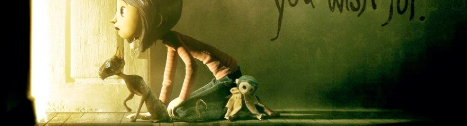
The Coraline font is also an interesting case study in branding. The film, based on Neil Gaiman’s novel, has become a cult classic, and a big part of that success lies in the careful crafting of its identity—fonts included. The title font isn’t just a design choice; it’s a key part of the film’s identity. It tells us who Coraline is, what she’s up against, and what kind of world she inhabits. It’s no accident that the font feels off-kilter. It’s the perfect visual reflection of the story’s tone: one that’s whimsical, dark, and a little bit sinister.
In this sense, the Coraline font becomes an emblem of the film itself, just like the shape of the house, the eerie button eyes, or the character of the Other Mother. Everything about the film’s branding contributes to the mood and atmosphere, giving us the sense that we’re stepping into a world where things may be strange and dangerous, but also enchanting.
A Final Thought on Fonts
As we’ve explored, fonts are far more than just letters strung together to create words. They are a form of expression, a method of communication that transcends mere text. The Coraline font, with its sharp edges and eerie aesthetic, is a perfect representation of the world it introduces. It tells us that we’re about to enter a place where nothing is quite as it seems, where things are just a little off—and where curiosity will lead us down a path we may not be prepared for.
So, the next time you see a title on a movie poster, or a logo on a website, take a moment to appreciate the font. It’s not just there to look pretty. It’s there to tell a story, to set a mood, and to give you a glimpse into the world you’re about to enter. And if you happen to be designing something yourself, remember: the font you choose might just be the key to unlocking the magic of your own creation.
Because fonts, my friends, are far more powerful than we give them credit for.